 Tiny Online Tools
CSS Grid Generator: The Fastest Way to Build Layouts
CSS Grid Generator: The Fastest Way to Build Layouts
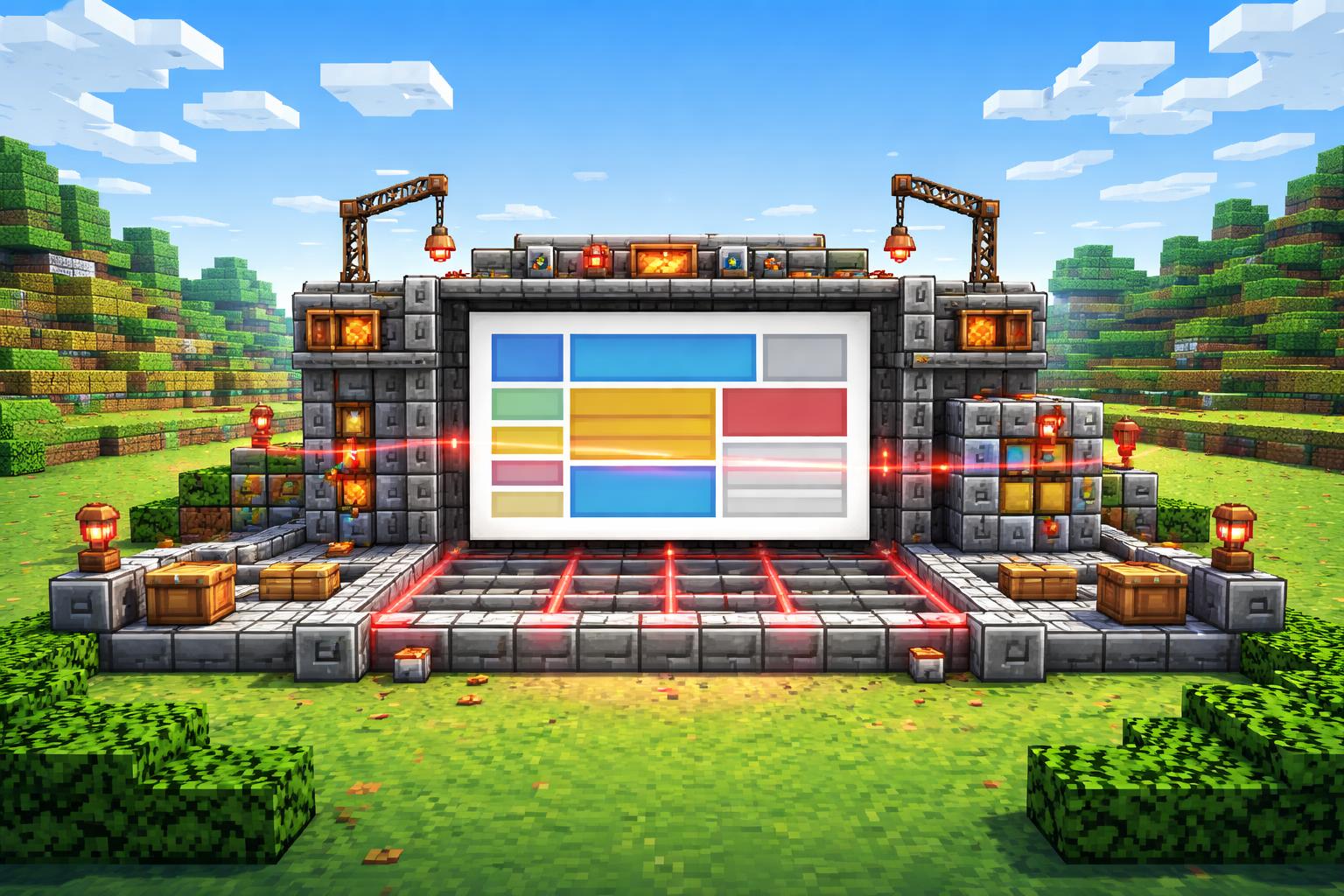
If CSS Grid has ever felt powerful but a little fiddly, you are not alone. The good news is that you do not need to memorize every grid shorthand before you start building. The CSS Grid Generator turns layout ideas into a live, visual workflow, so you can shape a page, preview it, and copy the code when it feels right.
That matters because layout is where a design either clicks or collapses. A strong grid helps you build responsive pages with cleaner structure, more predictable spacing, and less trial-and-error in your editor. With the CSS Grid Generator, you can experiment faster, compare options instantly, and ship a layout that feels intentional instead of improvised.
What CSS Grid Generator is great for
The CSS Grid Generator is especially useful when you want to move from idea to implementation quickly. It is built for responsive CSS Grid layouts with a live preview and copy-ready code, which makes it practical for both learning and production work.
Here are a few common use cases:
- Landing pages — Build a hero, feature cards, and a footer grid without fighting your spacing.
- Dashboards — Prototype panels, sidebars, and content regions that need to resize cleanly.
- Portfolio sections — Create galleries and content blocks that stay organized across breakpoints.
- Learning CSS Grid — See how rows, columns, and alignment choices affect the final layout.
Why it speeds things up
Traditional layout work often looks like this: write some CSS, refresh the browser, notice the spacing is off, tweak it again, and repeat. A visual generator cuts out a lot of that back-and-forth.
With a tool like CSS Grid Generator, you can:
- test different column counts and spacing patterns more quickly
- verify how a layout feels before you paste code into your project
- create a cleaner starting point for responsive design
- reduce the chance of accidental layout drift later
It is also a nice way to avoid the “I know Grid, but I do not want to think about every property right now” problem. Sometimes you want a reliable layout scaffold, not a weekend project.
How to use it
Using CSS Grid Generator is straightforward:
- Open the tool.
- Adjust the grid settings until the preview matches your layout idea.
- Check how the visual structure behaves as you refine the design.
- Copy the generated CSS.
- Paste it into your project and fine-tune as needed.
That last step is important: the generator should get you 90% of the way there fast, while still leaving room for your own design choices.
A few practical tips
If you want better results from the CSS Grid Generator, keep these tips in mind:
- Start with the simplest grid that fits the content.
- Design for the content you actually have, not the content you wish you had.
- Use the preview to test whether cards, panels, or sections stay readable at different sizes.
- Save the generator for moments when structure matters more than visual decoration.
Pair it with other layout tools
CSS Grid is not the only way to build interfaces. Depending on your project, you might also want to explore Flexbox Generator for one-dimensional alignment, CSS Keyframes Generator for motion, CSS Animation Generator for reusable animated effects, CSS Clip-Path Generator for shape work, or CSS Gradient Text Generator for a quick visual polish.
The point is not to use more tools for the sake of it. The point is to pick the right one for the job. For layout-heavy work, CSS Grid Generator is usually the fastest way to get a clean, responsive foundation in place.
Final thoughts
If you build websites regularly, a good grid setup saves time every week. The CSS Grid Generator makes that setup easier to explore, easier to copy, and easier to trust. Whether you are prototyping a dashboard, assembling a landing page, or just trying to remember the right grid pattern, it gives you a fast path from idea to code.
When layout is the bottleneck, use the generator. When motion, alignment, or decorative effects take over, reach for the matching design tool. Either way, tiny-online.tools keeps the workflow simple, browser-based, and quick enough to stay in the flow.