 Tiny Online Tools


Build Complex Text Shadow Effects Visually Without CSS Trial-and-Error
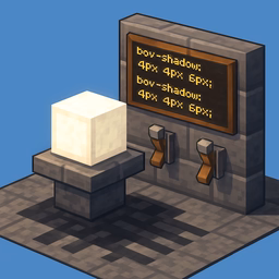
Text shadows are one of CSS's most creative typography features, enabling depth effects, glowing light, neon signs, 3D illusions, and subtle dimension. But stacking multiple shadow layers with different offsets, blur radii, and colors quickly becomes overwhelming in plain CSS. This generator lets you design shadow effects visually, preview them instantly, and copy the complete code without manual tweaking.
Understand Text Shadow Mechanics
Every text shadow has four key properties: horizontal offset (pushes the shadow left or right), vertical offset (pushes down or up), blur radius (softness of the shadow edge), and color (including opacity). A single shadow is simple, but layering multiple shadows creates complex lighting effects. This tool lets you see exactly how each parameter affects your text and how layers combine, removing the guesswork entirely.
Four Built-In Effect Presets for Instant Inspiration
Neon Glow: Multiple bright, colored shadow layers creating a glowing neon sign effect. Perfect for cyberpunk aesthetics, gaming interfaces, and eye-catching hero headlines. Start with this and adjust colors and blur for your brand.
3D Effect: Shadows offset in a consistent direction creating depth and dimension, as if the text is floating above the page. Ideal for modern product landing pages and visual hierarchy emphasis. Control the shadow offset to make the 3D effect more or less pronounced.
Retro: Warm, multiple offset layers creating a vintage print or 70s aesthetic. Perfect for nostalgia-driven designs, retro branding, and historical content. Adjust the color palette to match your design era.
Subtle: Minimal, soft shadows that add sophistication without distraction. Use this for professional interfaces, body text emphasis, and situations where readability must come first.
Layer-by-Layer Shadow Control
Each shadow layer has independent control over horizontal offset, vertical offset, blur radius, and color. Add as many layers as needed—the tool keeps track and combines them seamlessly. See your effect rendered in real time against your chosen background color, ensuring it works in actual context. Adjust text color, font size, and preview text to match your real use case.
Professional Applications Across Design Disciplines
Hero Headlines and Marketing: Make impactful hero text stand out with subtle depth or bold glowing effects that grab attention without overwhelming the message.
Badge and Badge Styling: Add dimension to UI badges, tags, and labels so they feel elevated and interactive. Shadows create visual hierarchy that guides users' eyes.
Logo and Branding: Test shadow effects on your logotype to add sophistication, playfulness, or dimension. Essential before integrating into brand guidelines.
Decorative Callouts and Testimonials: Use shadows to make highlighted quotes, testimonial text, or key messages feel special and emphasized.
Export Ready-to-Use CSS
Once you've designed your perfect shadow effect, copy the complete CSS text-shadow property with one click. The syntax is production-ready and works across all modern browsers. Test the effect at the sizes where it will actually appear in your interface—effects that look great at 48px might feel overwhelming at 16px body text size.