Tiny Online Tools logoTiny Online ToolssearchSearch tools…grid_viewAll Tools
Homechevron_rightDesign Toolschevron_rightColor Contrast CheckerColor Contrast Checker

Color Contrast Checker

Check WCAG 2.1 color contrast ratios for accessibility.

#f8fafc#111827

Sample Heading Text

The quick brown fox jumps over the lazy dog. This is body text at 16px to demonstrate readability at normal size.

16.96:1
Contrast Ratio
WCAG 2.1 Results
check_circle
AA Normal Text
Min 4.5:1Body text, UI components
PASS
check_circle
AA Large Text
Min 3:118pt+ or 14pt+ bold
PASS
check_circle
AAA Normal Text
Min 7:1Enhanced: body text
PASS
check_circle
AAA Large Text
Min 4.5:1Enhanced: large text
PASS

Similar Tools

Color Palette Generator

Color Palette Generator

Generate harmonious color palettes from a single base color.

Random Color Generator

Random Color Generator

Generate random color palettes with harmony rules.

Random Color List

Random Color List

Generate multiple random colors or harmony-based color sets.

Tailwind Color Generator

Tailwind Color Generator

Generate a Tailwind-style color scale and config snippet from a base color.

SVG Heart Generator

SVG Heart Generator

Generate stylized SVG heart shapes — classic, rounded, pointed, pixel, and geometric — with custom colors, gradients, strokes, and sizes. Free online heart maker.

Color Replace Tool

Color Replace Tool

Replace one color in an image with another. Adjustable tolerance for color distance. Fully private, runs in your browser.

Random Date Generator

Random Date Generator

Generate random dates within a specified range with options for count, format, and time.

apps

More Tools

Browse our full collection of free online tools.

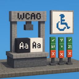
Check contrast before colors ship to production

A palette can look beautiful and still fail accessibility requirements. This checker helps you test foreground and background combinations against WCAG contrast thresholds so you can catch issues before they land in a design system, component library, or live product.

What the results tell you

The tool shows the contrast ratio and whether the pair passes common WCAG levels for:

  • normal text at AA
  • large text at AA
  • normal text at AAA
  • large text at AAA

Why this matters in real projects

Color contrast checks are useful when you need to:

  • validate brand colors in UI components
  • test text on buttons, cards, and banners
  • review accessibility during design handoff
  • avoid unreadable combinations for low-vision users

Passing contrast is not the whole story

A pair can technically pass and still feel uncomfortable at small sizes or light weights. After the ratio looks good, it is still worth reviewing the live preview in realistic text sizes before treating the combination as final.