
How to Use a Glassmorphism Generator for Modern UI
How to Use a Glassmorphism Generator for Modern UI
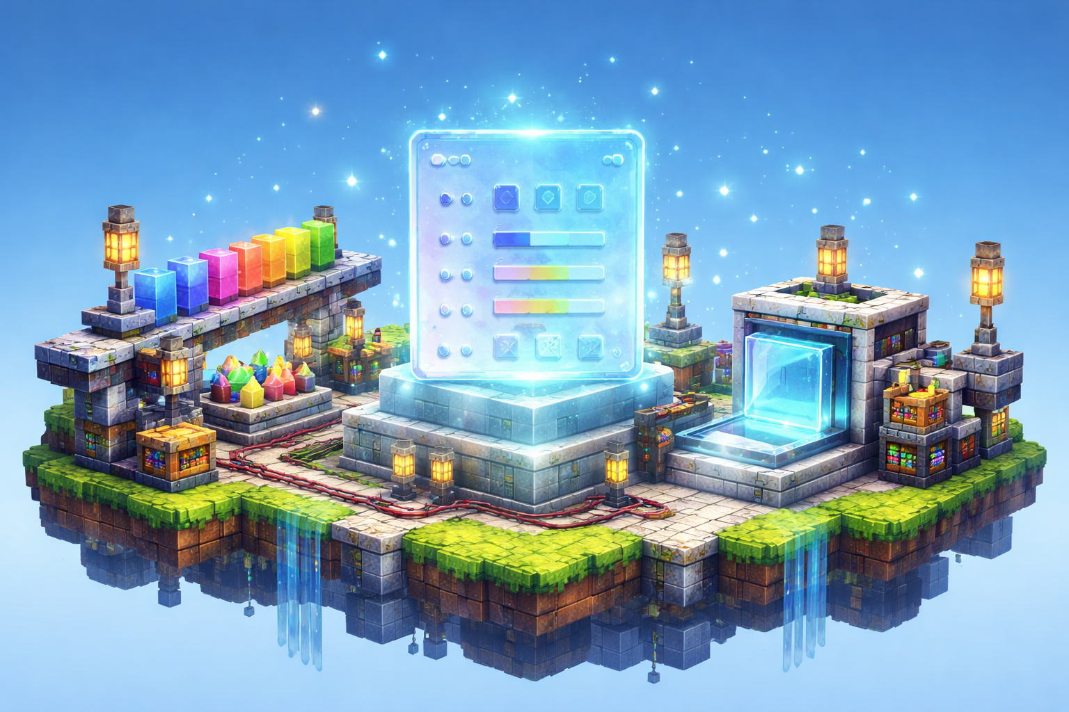
If you want a sleek interface that feels modern without looking sterile, glassmorphism is one of the fastest styles to reach for. The trick is getting the balance right: enough blur to create depth, enough tint to keep text readable, and enough border contrast so the panel still feels defined. That is exactly where the Glassmorphism Generator earns its keep.
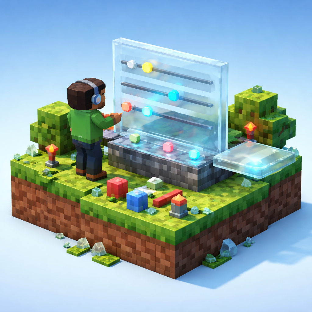
Instead of hand-tuning CSS values blindly, you can explore blur, tint, and border controls in one place and immediately see the effect. The Glassmorphism Generator is built for quick visual iteration, which makes it useful whether you are designing a landing page, building a dashboard, or just testing a new visual direction.
What glassmorphism actually helps you do
At its core, glassmorphism is about creating translucent panels that sit on top of colorful or textured backgrounds. A good glass panel suggests depth, separation, and polish. A bad one can become muddy, low-contrast, and hard to read.
That is why a generator matters. With the Glassmorphism Generator, you can quickly test how blur, tint, and border settings interact before you copy the CSS into your project. It saves time, but more importantly, it helps you make better design decisions.
Three practical ways to use it
1) Design hero sections and feature cards
Glass panels work especially well in hero sections where you want a premium, light, airy feel. Try different blur levels and tints until the card separates clearly from the background image. Then use the result for pricing cards, feature highlights, or CTA blocks.
2) Match glass effects across a whole UI
Consistency matters. If one panel is frosty and another is nearly opaque, the interface starts to feel accidental. Use the Glassmorphism Generator to establish one visual recipe, then reuse it for modals, sidebars, and widgets.
3) Prototype quickly before handoff
Design reviews move faster when people can see a style instead of imagining it. A generator lets you produce a working CSS example early, so product teammates can react to the look and feel before development gets too deep.
A simple workflow that works
Here is a straightforward way to use the tool without overthinking it:
- Start with a background that has enough color variation to show the blur effect.
- Open the Glassmorphism Generator.
- Adjust blur first, since that has the biggest impact on the glass feel.
- Tune tint so the panel stays readable against the backdrop.
- Add a border that gives the edge a subtle highlight.
- Check contrast with your text and buttons.
- Copy the CSS and test it in your actual layout.
That last step is important. Glass effects often look great in isolation but need a real page to prove they work. A generator is a starting point, not the final answer.
Tips for better results
- Keep the background busy enough to justify the blur, but not so noisy that the text disappears.
- Use moderate tint values so the panel still feels translucent.
- Make borders subtle. Overly bright edges can make the design look fake.
- Use glass sparingly. One or two strong glass panels usually feel more polished than a whole page of them.
- Pair the effect with strong typography and spacing so the UI still feels intentional.
Compare it with other design helpers
Glassmorphism is part of a broader family of visual styling tools, and it becomes more useful when you combine it with other generators. For example, Gradient Border Generator is a natural companion when you want edges that feel more decorative. CSS Gradient Text Generator can help you bring the same visual energy into headings.
If motion is part of your layout, CSS Animation Generator is a good way to add movement without writing keyframes from scratch. For softer interface systems, Neumorphism Generator gives you another depth-driven style to compare. And if your layout needs structure first, CSS Grid Generator can help you map the page before you decorate it.
When not to use glassmorphism
Like any trend, glassmorphism is best when it supports the content. Avoid it when:
- readability is more important than visual flair
- the background already has too much visual noise
- the interface needs to feel minimal, utilitarian, or serious
- the glass effect competes with charts, data tables, or dense content
A clean app does not need every card to shout. Sometimes the smartest move is to reserve glass effects for a single focal area and keep the rest of the interface calm.
Final thoughts
If you are exploring a modern UI style, the Glassmorphism Generator is a fast way to move from idea to usable CSS. It helps you test the delicate combination of blur, tint, and border control without wasting time on trial and error.
Use it to prototype hero sections, unify card styles, and compare glass against other visual treatments. Once you have a recipe that works, you can copy it into your project and keep moving.
For quick, browser-based design work, that is the sweet spot: less guessing, more making.